The two pictures either side were James Arthurs first digipak after becoming an artist and winning the X factor, and that is shown in the bottom corner, along with the charity the donations go with.
His whole look is very clear in the medium shot of James, showing his tattoos and his style which make him more memorable as an upcoming artist.
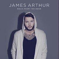
This is the third digipak James Arthur released, and his tattoos are still noticeable, however his name is not as big as it was before as he is becoming his own individual artist now and people can already identify him.
He is following conventions and is looking directly into camera.
The institutional details of Sony which own pretty much everything in the music business are on the CD cover.
It is interesting to note, as we are creating a tour dates poster for our artist too, that James Arthurs first tour date poster was very dark, and as an upcoming artist, it is breaking conventions to not look into the camera and have a clear image of his face.
There is a range of font sizes in both tour dates posters, with contact institutional details - with websites - emails and numbers. Then in the second there is social media added.

However it is also interesting to note that his tour two years later is much lighter, and has huge synergy and is practically the same image as the digipak. They've followed conventions and had a picture of the front cover of the digipak, using the sell line of 'out now'.
The font style has remained the same, and the alignment of the texts have also remained the same with the text being towards the right. The font is bold and all capitals.
James Arthur is following conventions in two out of three of these images as he is looking into the camera, the writing is on the write of frame in both of his tour date posters and has very small kerning and doesn't use any drop capitals.
I was unable to find a digipak poster so therefore had to use tour posters.


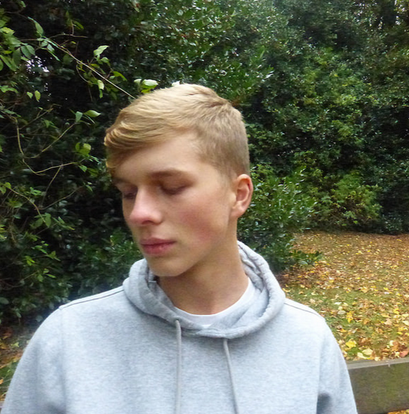
 Unfortunately Lauren and I, had the wrong camera settings on when taking still images for the digipak and digipak advert for the ancillary task - this lead to the picture quality being very poor and making our digipak and digipak advert look very unprofessional.


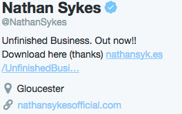
 His twitter account has his main picture of the album cover that I have used thing link to analyse, and his cover photo seems to be similar to a digipak advert however does not have any institutional details, but does follow the conventions of using sell lines such as "out now" and advertises his famous most recent track "Famous".
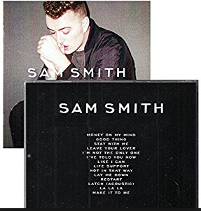
 The digipak has strong synergy with the digipak advert. The font used on the digipak is consistent with the back of the album and with the track names. Sam is breaking conventions and not looking directly into camera.


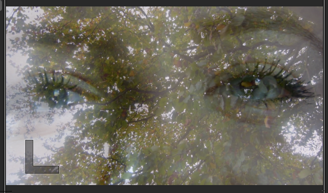
 And used lens flare as I panned around the loved up couple in the park and it works very well with the natural lighting.


 The two pictures either side were James Arthurs first digipak after becoming an artist and winning the X factor, and that is shown in the bottom corner, along with the charity the donations go with.
 This is the third digipak James Arthur released, and his tattoos are still noticeable, however his name is not as big as it was before as he is becoming his own individual artist now and people can already identify him.
 In order to organise our actors my partner Lauren and I thought it most appropriate to create a group chat on Facebook in which we could all discuss which times and dates were most suitable for each of us individually.
 The screenshot to the left shows me asking Julian what days of the week he was free in the October half term from the 21st of October to the 31st.