Examples of where the main product (music video) combines with the above ancillary tasks:
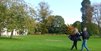
As mentioned above the tree's are a motif for Ben's vulnerability as well as representing how because they're natural they are similar to Abby's beauty. This therefore offers oppositional readings to the audience on how they chose to perceive the trees.
The settings we used for the shots are rural because I wanted to adhere to conventions of a pop acoustic music video. That is also why I made the background of the digipak and digipak advert have trees in the background, to establish a clear connection between the music video and the ancillary tasks.

The digipak advert features Ben posing in the foreground with trees in the background. I think this composition was effective because I like the way I blurred the background and tainted it green which creates a misty effect. I think this is appropriate to connote Ben's uncertainty throughout his relationship with Sophie.

 Upon reflection, I think that the digipak may feature too many shots of trees as the background too foten, as kit is on 4 of the 6 panes. The digipak may have appeared more aesthetically pleasing to a younger TA audience if it had more variety, for example using the Humber Bridge shot as the background of one of the panes as it may have appeared more eye catching.
The establishing shot in the music video features the lighting of the candles. This is symbolic of our star, Ben, attempting to re-kindle his relationship with Abby. This particular symbol is repeated throughout the music video in order to provide the viewers with clues as to the current state of Abby and Ben's relationship. For example, at the end of the music video, when Abby and Ben's relationship ends.The symbol is re-occuring. Therefore, I suggested that this may be a good sign which could be used to identify Ben and his music.


I used a similar shot for the back pane of the digipak because I think the composition is particularly aesthetically pleasing, as well as being the first shot the viewer sees. Therefore, it is possibly the most memorable in the video. I also used the eyedropper tool to select the colour from the digipak and use it to colour the'Now' on the digipak advert. Therefore, the music video, digipak and digipak advert are synergetic.
I have also used shallow focus in the music video contrasting with clearer images to symbolise Ben's previously unstable relationship, followed by his realisation that his romance with Abby could not continue.
Furthermore, to link the music video with the digipak and the digipak advert I also used blurs. For example, I used shallow focus on the lyric pane of the digipak.
 In the conclusion of the narrative, the colour blue features heavily as the background of the humber bridge set against the bright blue sky is used for a lot of shots.
I used the colour blue in the digipak by choosing a dark blue hoody for Ben costume.
Upon reflection, I think it would have been more effective if we used a larger range of costumes for the digipak because it would have allowed for different representations of Ben as a character and would also increase the audience interest in the product.

The use of right framing creates synergy between the music video and the digipak advert. In the first shot, Ben is portrayed in a point of view shot as he sees Abby and Joe embracing near the bridge. Ben's realisation of Abby's infidelity is symbolised through the framing, because Ben being right of frame connotes that he is no longer at the centre of Abby's life, and she can no longer be in his.
Ben is also photographed right of frame in the digipak advert image, which creates the synergy.

I have also frequently used low angle shots to photograph Ben in the digipak, the advert and the music video, which creates synergy throughout all three products. Ben is represented as being the emotionally weaker character, because Abby's infidelity ultimately leaves him heartbroken, insecure and uncertain as to the future of the relationship.
However, I wanted to connote that Ben would eventually overcome his issues and the audience would again have some restored hope. Therefore, I used the low angle to occasionally symbolise Ben's developing strength as he begins to realise that the relationship is over, and he moves on.
I used this angle on the digipak because I wanted to represent Ben as a strong and respected character.

No comments:
Post a Comment